


Lesson 4.5 Scatter plots
Presentation
•
Mathematics
•
8th Grade
•
Easy
+2
Standards-aligned
Ashley Harshbarger
Used 440+ times
FREE Resource
10 Slides • 7 Questions
1
Lesson 4.5 Scatter plots
2
Learning Goals:
I can create and interpret scatter plots.
I can use trend lines to make predictions.
3
Vocab
Scatter plot: a graph with points plotted to show a relationship between 2 sets of data
4
Example 1
The table shows the number of species added to the list of endangered and threatened species in the United States during the given years. Graph a scatter plot using the given data.
5
Vocab
Correlations: describes relationships between 2 sets of data
Positive Correlation: both data sets increase
Negative Correlation: one set increases while the other decreases
No Correlation: No relationship
6
Example 2
Describe the correlation illustrated by the scatter plot.
7
Example 3
Identify the correlation you would expect to see between each pair of data sets. Explain.
A. The number of empty seats in a classroom and the number of students seated in the class
B. The number of pets a person owns and the number of books that person read last year.
C. The monthly rainfall and the depth of water in a reservoir
8
Multiple Choice
Which scatter plot show a positive relationship?
Graph A
Graph B
Graph C
Graph D
9
Multiple Choice
What type of correlation does this scatter plot show?
positive
negative
no correlation
nonlinear association
10
Multiple Choice
What type of correlation does this graph have?
Negative
no association
positive
11
Example 4
Choose the scatter plot that best represents the relationship between the number of days since a sunflower seed was planted and the height of the plant. Explain.
12
Multiple Choice
Which sentence describes the relationship shown on this scatter plot?
As the temperature decreases, the visitors increase.
As the temperature increases, the number of visitors increases.
As the visitors increase, the temperature decreases.
No correlation
13
Vocab
Trend Line (Line of best fit): Shows correlation between the data sets
14
Example 5
The scatter plot shows a relationship between the total amount of money collected and the total number of rolls of wrapping paper sold as a school fundraiser. Based on this relationship, predict how much money will be collected when 175 rolls have been sold.
15
Multiple Choice
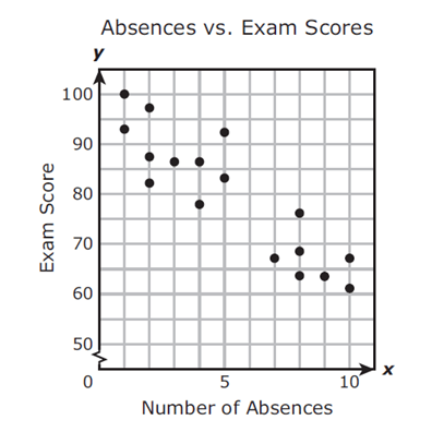
Mrs. Collins made a scatterplot to show the relationship between the number of absences and a student’s final exam score. Based on this scatterplot, a student with 12 absences should get approximately what score on the final exam?
60
92
70
76
16
Multiple Choice
17
Multiple Choice
What type of correlation does this graph have?
positive
negative
none
all of the above
Lesson 4.5 Scatter plots

Show answer
Auto Play
Slide 1 / 17
SLIDE

Similar Resources on Wayground
13 questions
Multi Step Equation Word Problems
Presentation
•
8th Grade
10 questions
Describing Rotations
Presentation
•
8th Grade
12 questions
Scatterplots & Linear Regression
Presentation
•
8th - 9th Grade
12 questions
x- and y-intercepts
Presentation
•
8th Grade
12 questions
Identifying Functions
Presentation
•
8th Grade
13 questions
Volume
Presentation
•
8th Grade
13 questions
Multiplying Scientific Notation
Presentation
•
8th Grade
13 questions
Similarity and Transformations
Presentation
•
8th Grade
Popular Resources on Wayground
24 questions
PBIS-HGMS Day 10
Quiz
•
6th - 8th Grade
10 questions
HCS SCI 03 Summer School Review 3
Quiz
•
3rd Grade
11 questions
Home Scope
Quiz
•
7th - 8th Grade
15 questions
HCS SCI 05 Summer School Assessment 3 Review
Quiz
•
5th Grade
35 questions
Lufkin Road Middle School Student Handbook & Policies Assessment
Quiz
•
7th Grade
18 questions
Geo 11.3 Area of Circles and Sectors
Quiz
•
9th - 11th Grade