

GCSE Paper 1 Exam Practice 1

Presentation
•
Other
•
10th Grade
•
Practice Problem
•
Hard

James McLaughlin
Used 2+ times
FREE Resource
19 Slides • 0 Questions
1
2
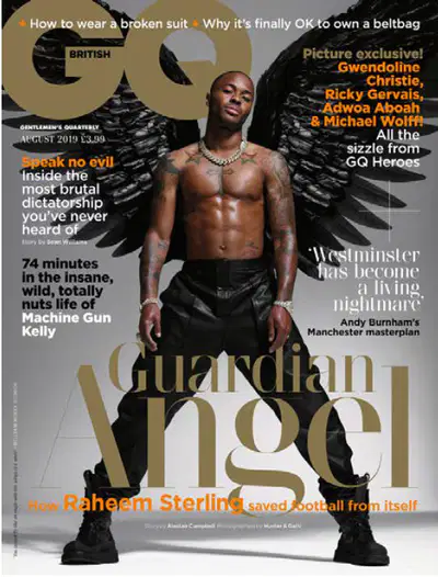
Question 1(a): Images (GQ front cover).
Pick a precise image feature (shot type, facial expression, pose/gesture, costume/tattoos, wings/props). Name it clearly.
Explain denotation → connotation (what we see → what it suggests about masculinity, status, identity, values). Use subject terms (e.g., direct mode of address, gesture codes).
Anchor the meaning to audience/brand/genre (why GQ uses this image choice for ABC1 men; how it creates appeal).
3
Model
The long/central image of Raheem Sterling establishes immediate star appeal and positions him as the cover’s focal point, constructing an aspirational masculine identity for GQ’s audience.
Sterling’s direct mode of address (eye contact) creates a personal connection with readers, a conventional magazine tactic that invites identification and purchase.
His pose and gesture (wide stance, composed gaze) connote confidence and power, aligning the cover star with a Proppian ‘hero’ figure that the brand celebrates.
The visible tattoos and stylised black wings signify identity, moral purpose and protection (the “Guardian Angel” idea), reinforcing GQ’s blend of style with values.
The fashioned costume elements (leather trousers/boots, jewellery/watch) connote luxury and modern masculinity, matching GQ’s premium, lifestyle focus for ABC1 men.
4
Question 1(b): Text / Written Language (GQ front cover)
Identify the key textual elements — masthead, cover line, main headline, tagline or pull-quote — and select one as your focus point.
Explain how language creates meaning through word choice (connotation, imperative, superlative, mode of address) and tone (formal, colloquial, exclusive).
Link to audience and brand identity — show how the text targets GQ’s ABC1 male readers and supports the magazine’s values of style, success and modern masculinity.
5
Model
The masthead ‘GQ’ uses a bold, san-serif font to connote confidence and simplicity, anchoring the magazine’s high-status male identity.
The cover line ‘RAHEEM STERLING: THE GUARDIAN ANGEL’ uses religious imagery to position Sterling as a protector figure — a Barthesian enigma that invites readers to decode why he is ‘angelic’.
The headline employs capitalisation and minimal punctuation, creating authority and focus on Sterling as GQ’s heroic subject.
The anchorage text supports GQ’s brand voice — exclusive, sophisticated and morally aware — appealing to an audience that values both style and substance.
The language choices encourage a polysemic reading: to some the headline signals fashion and celebrity; to others it hints at Sterling’s social activism and leadership.
6
Question 1(c): Layout and Design (GQ front cover)
Identify layout features – composition, framing, colour palette, typography, spacing, rule of thirds, or layering of text and image.
Explain how these elements create meaning – consider how hierarchy, balance, and colour contrast communicate tone, professionalism, and GQ’s brand identity.
Link to audience/genre – show how the sleek, minimal layout targets ABC1 men and fits the conventions of upmarket men’s fashion magazines.
7
Model
The central composition positions Raheem Sterling as the focal point, establishing dominance and reinforcing his star status.
A clean, symmetrical layout with minimal cover lines reflects GQ’s luxury aesthetic and aligns with modern masculine minimalism.
The colour palette of black, gold and white connotes sophistication, power and purity – qualities associated with premium brands.
Typography hierarchy ensures the masthead and main cover line command attention, guiding the reader’s gaze through visual flow.
The negative space around the model adds balance and elegance, inviting audiences to view GQ as a refined and exclusive product.
8
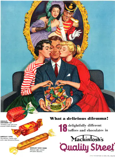
2(a) Explain how historical context influences print advertisements. Refer to the print advertisement for Quality Street (1956). [5]
Identify the historical period – mention post-war Britain (1950s) and how society was changing (e.g. gender roles, class, consumerism).
Link context to representation – explain how the imagery or characters (e.g. Regency couple, factory worker) reflect 1950s values and ideals.
Explain why this context shapes meaning – connect the advert’s design or message to audience expectations at that time (nostalgia, tradition, family, reward).
9
Model
The advert was produced in 1956, a post-war period when Britain was rebuilding, and audiences desired products that symbolised comfort, celebration, and normality.
The Regency-dressed “Quality Street” couple reflects nostalgia for Britain’s past and social hierarchy, appealing to audiences who valued tradition and refinement.
The factory girl offering sweets mirrors 1950s gender expectations — women seen as caring, domestic, and polite — reinforcing the essentialist stereotype of women as providers of comfort.
The bright colours and elegant packaging reflect the rise of consumer culture in the 1950s, when advertising promoted luxury and aspiration to a growing middle class.
The slogan and imagery together suggest that buying Quality Street was an act of sophistication, linking everyday consumption with the glamour of Britain’s imagined past.
10
Question 2(b): Compare how historical context influences representation in the Quality Street (1956) and Axe Peace (2014) print adverts [25]
Identify key contexts — 1950s post-war Britain (Quality Street) vs. 2010s globalised, media-savvy masculinity (Axe Peace).
Explain how each reflects its time — Quality Street presents idealised gender/class hierarchies and nostalgia; Axe Peace re-brands masculinity as caring, ironic and globally aware.
Compare audience impact — how representations in each product attract or reassure their target audiences, showing change in social values across decades.

11
Model
The Quality Street advert (1956) uses a Regency couple and factory girl to reinforce 1950s social order — men as upper-class charmers, women as polite and nurturing — typical of post-war essentialist gender roles.
Its nostalgic mise-en-scène and elegant costumes evoke a stable, traditional Britain, reassuring audiences still recovering from wartime disruption.
By contrast, Axe Peace (2014) emerges from a global, media-aware culture that rejects aggression in favour of empathy, parodying old stereotypes of the “lad.”
The campaign’s tagline “Make Love Not War” re-appropriates 1960s protest language, presenting modern men as agents of peace rather than conquest.
Whereas Quality Street idealises women as passive givers of pleasure, Axe Peace re-positions men as emotionally intelligent partners, mirroring 21st-century shifts toward equality and self-awareness.
Both adverts use romance and aspiration, but Quality Street encodes conservative reassurance while Axe Peace encodes progressive irony — a clear reflection of changing historical contexts.
12
3(b) Briefly explain the difference between how public service radio and commercial radio are funded. [4]
Identify the two sectors: Public Service = BBC Radio; Commercial = Private companies.
Explain where their money comes from (public licence fee vs advertising/sponsorship).
Mention purpose difference — BBC serves the public; commercial stations seek profit.
13
Model
Public service radio, like BBC Radio 4, is funded by the TV licence fee paid by UK households.
This ensures content is free from adverts and supports programmes that inform, educate and entertain.
Commercial radio relies on advertising, sponsorship and competitions to generate revenue.
Its main goal is to attract large audiences to satisfy advertisers and increase profit.
14
3(b) Explain how radio programmes use technologies to reach audiences. Refer to The Archers to support your points. [12]
Identify broadcast technologies — FM/DAB, digital streaming, BBC Sounds, podcasts, smart speakers.
Explain how each extends accessibility — on-demand listening, multiplatform access, global streaming.
Use The Archers as your example — long-running BBC Radio 4 drama adapting to modern platforms.
15
Model
The Archers is broadcast daily on BBC Radio 4 FM and DAB, maintaining traditional linear audiences.
The programme is also available on BBC Sounds and as a podcast, allowing listeners to stream or download episodes on-demand.
Smart speaker integration (“Alexa, play The Archers”) widens reach to digital users and younger audiences.
The BBC’s official website hosts episode summaries, cast interviews and social media links, encouraging online interaction and audience loyalty.
Through cross-platform distribution, The Archers stays accessible worldwide and continues to reflect the BBC’s public service mission in a digital age.
16
Briefly explain how the content of The Sun website appeals to a younger audience. [4 marks]
Identify specific content types — celebrity news, entertainment, football, lifestyle, and trending stories.
Explain why these appeal — informal tone, short articles, visuals, shareable headlines.
Link to younger audience habits — mobile use, social media culture, quick updates, and humour.
17
Model
The Sun website uses celebrity gossip, reality TV coverage and viral stories, which connect with the everyday interests of younger audiences.
The informal and humorous language makes articles feel conversational and easy to read on mobile devices.
Frequent football and entertainment updates encourage daily visits and reflect topics young people engage with on social media.
Bright images, clickbait-style headlines and video content provide instant gratification, matching the fast-paced habits of younger online users.
18
Explain why audiences may interpret the same media product in different ways. Refer to The Sun to support your points. [12 marks]
Identify specific content types — celebrity news, entertainment, football, lifestyle, and trending stories.
Explain why these appeal — informal tone, short articles, visuals, shareable headlines.
Link to younger audience habits — mobile use, social media culture, quick updates, and humour.
19
Model
According to Stuart Hall’s Reception Theory, audiences do not all respond in the same way — they decode media messages based on their own social and cultural experiences.
A preferred reading of The Sun’s front pages would come from loyal readers who agree with its patriotic and populist values, seeing the paper as representing “ordinary people.”
A negotiated reading might come from audiences who enjoy the celebrity and sports coverage but question some political bias or sensationalism.
An oppositional reading may come from readers with left-wing or liberal views who reject The Sun’s anti-immigration or royalist headlines, viewing them as manipulative.
For example, coverage of a royal family story could be seen by some as positive national pride, while others view it as distracting “soft news.”
Similarly, a political headline supporting the government may reassure some readers of national stability but anger others who see bias or unfair framing.
Age and digital media use also shape responses — younger audiences encountering The Sun online may interpret content ironically or as clickbait, while older print readers see it as trustworthy news.
Cultural context influences interpretation: readers from outside the UK might not share The Sun’s nationalist tone, producing different emotional reactions.
The variety of interpretations shows that meaning is polysemic — The Sun encodes multiple layers (humour, politics, gossip) that can be read in diverse ways.
Show answer
Auto Play
Slide 1 / 19
SLIDE
Similar Resources on Wayground

13 questions
Geo 2.1b - Parallel Lines Cut by a Transversal
Presentation
•
10th Grade
13 questions
Polynomial Multiplication
Presentation
•
10th Grade
16 questions
6/1: Evolution: Gene Variation
Presentation
•
10th Grade
16 questions
Ten Steps of the AVID Tutorial
Presentation
•
10th Grade
14 questions
Report Text Bahasa Inggris Peminatan
Presentation
•
10th Grade
14 questions
8. Indirect questions
Presentation
•
10th Grade
15 questions
Narrative Text
Presentation
•
10th Grade
15 questions
Neolithic Revolution & Early Civilizations
Presentation
•
10th Grade
Popular Resources on Wayground
10 questions
Safety Day 2026 – Student Review

Quiz
•
9th Grade
21 questions
Continents and Oceans
Quiz
•
6th Grade
20 questions
Parts of Speech
Quiz
•
5th Grade
16 questions
Subject & Predicate
Quiz
•
5th Grade
25 questions
Multiplication Facts
Quiz
•
5th Grade
12 questions
Map Skills
Quiz
•
3rd Grade
22 questions
Continents and Oceans
Quiz
•
5th Grade
15 questions
Rounding Decimals
Quiz
•
5th Grade
Discover more resources for Other
26 questions
SLIME!!!!!
Quiz
•
KG - 12th Grade
20 questions
Cell organelles and functions
Quiz
•
10th Grade
10 questions
Exploring Chemical and Physical Changes

Interactive video
•
6th - 10th Grade
20 questions
Cell Transport
Quiz
•
9th - 12th Grade
10 questions
Exploring the Basics of Exponents
Interactive video
•
6th - 10th Grade
20 questions
Budgeting
Quiz
•
9th - 12th Grade
20 questions
Investing
Quiz
•
9th - 12th Grade
20 questions
Preterite vs. Imperfect
Quiz
•
10th Grade