
Scatter Plot Mix It Up Lesson
Presentation
•
•
Hard
Gena Calvert
FREE Resource
31 Slides • 49 Questions
1
A scatter plot is a graph that is used to show data between two variables, also known as bivariate data.
For ex: height and weight.
Scatter plots show patterns, trends, and associations between variables that could impact each other.
Scatter Plots
2
Positive Association | Negative Association | No Association |
|---|---|---|
Both variables are increasing. | One variable is increasing, the other is decreasing. | There is no relationship between the variables. |
Types of Association
3
Multiple Choice
positive
negative
none
all of the above
4
Scatter Plots can be described as linear and non-linear models. They are not perfectly linear or non-linear but they follow a trend.
Linear vs. Non-linear Models
5
Multiple Choice
Graph A
Graph B
Graph C
Graph D
6
Outliers | Clusters |
|---|---|
An outlier is a data point in a scatter plot that does not follow the trend of the data. | A group of data points that are closely grouped together. |
outlier
cluster
7
Multiple Choice
What are the coordinates of the outlier?
(1,9)
(9,1)
(2,2)
y=x
8
To show the overall trend of a data set, we can use a Line of Best Fit.
A line of best fit should:
Follow the trend of the data
Split the data in half
Help to estimate or predict values that are not already given in the set.
Line of Best Fit
9
Multiple Choice
A
B
C
D
10
Multiple Choice
A
B
C
D
11
Multiple Choice
Determine the correlation.
positive
negative
no correlation
12
Multiple Choice
Determine the correlation.
positive
negative
no correlation
13
Multiple Choice
12 chapters
15 chapters
18 chapters
21 chapters
14
Drag and Drop
y =
15
Drag and Drop
Fill in the blanks based on what he would need to type into a calculator to make this prediction:
16
Reminders
Types of association
17
Negative Correlation
18
Multiple Choice
Describe the correlation in the graph shown.
Strong Negative
Strong Positive
Weak Negative
Weak Positive
19
Multiple Choice
Estimate the correlation coefficient for this scatterplot.
A) r = 1.2
B) r = 0.89
C)r = 0
D) r = -0.89
20
Multiple Choice
Estimate the correlation coefficient for this scatterplot.
A) r = -0.9
B) r = 1
C) r = 0.9
D) r = -1
21
Multiple Choice
Describe a correlation with a coefficient of r=0.3
Strong positive
Weak positive
Strong negative
Weak negative
22
Multiple Choice
About how many points would we expect if Vasu played 40 minutes?
10
24
28
32
23
Poll
How well do you understand scatter plots?
Thumbs up! (I got it)
Thumbs Sideways(Im getting it)
Thumbs down(why do we keep learning japanese in math?)
24
4.5 -
Scatter Plots
Scatter Plots and Trend Lines
25
Vocab
Scatter plot: a graph with points plotted to show a relationship between 2 sets of data
Correlations: describes relationships between 2 sets of data
Positive Correlation: both data sets increase
Negative Correlation: one set increases while the other decreases
No Correlation: No relationship
Trend Line (Line of best fit): Shows correlation between the data sets
26
Example of a scatter plot
27
Bivariate data consist of two variables or two numerical observations. A scatter plot is a graph that shows the relationship between bivariate data. The data is graphed as ordered pairs on the coordinate plane. Once variable or value, does not necessarily depend on the other variable or value.
28
Multiple Choice
29
Association/Pattern
30
31
To show the overall trend of a data set, we can use a Line of Best Fit.
A line of best fit should:
Follow the trend of the data
Split the data in half
Help to estimate or predict values that are not already given in the set.
Line of Best Fit
32
Multiple Choice
Which sentence describes the relationship shown on this scatter plot?
As the temperature decreases, the visitors increase.
As the temperature increases, the number of visitors increases.
As the visitors increase, the temperature decreases.
No correlation
33
Multiple Choice
What type of correlation does this scatter plot show?
positive
negative
no correlation
nonlinear association
34
Multiple Choice
What type of correlation does this graph have?
positive
negative
none
all of the above
35
Scatter Plots can be described as linear and non-linear models. They are not perfectly linear or non-linear but they follow a trend.
Linear vs. Non-linear Models
36
Multiple Choice
37
Multiple Choice
38
Multiple Choice
What type of correlation is seen?
strong positive
strong negative
weak positive
none
39
Multiple Choice
What type of correlation (association) would you expect between the given variables?
The outside temperature and the amount of layers you wear.
40
Multiple Choice
What type of correlation (association) would you expect between the given variables?
The number of siblings you have and your weight.
41
The numbers on the bottom of the next slide are the "correlation coefficients" -- pay close attention to them. How do they relate to the "slope" of the data?
42
43
Multiple Choice
Describe the following correlation coefficient.
r=−0.89
44
Multiple Choice
45
Multiple Choice
Describe the following correlation coefficient.
r=−0.91
Strong positive
Weak positive
Strong negative
Weak negative
46
Multiple Choice
Describe the correlation. r = 0.3
Strong, positive
Weak, positive
Strong, negative
Weak, negative
47
Multiple Choice
48
Multiple Choice
What kind of association does the scatter plot show?
Positive
Negative
No association
49
Multiple Choice
50
Multiple Choice
Which scatter plot shows both positive and linear association?
51
Multiple Choice
52
Scatter Diagrams and Correlation
53
Learning Objectives
Able to understand bivariate data
Able to draw scatter diagram
Able to identify whether or not there is a positive or a negative correlation between the two variables
Able to draw lines of best fit
54
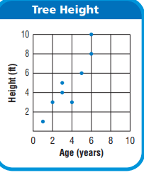
Multiple Choice
If a squirrel climbs to the top of each tree that is 6 years old, how far has the squirrel climbed?
2 ft
18 ft
10 ft
11 ft
55
Multiple Choice
What is the age of the tree that is 8 feet tall?
6 Years
7 Years
8 Years
9 Years
56
Introduction
Bivariate data is data for two variables (usually two types of related data).
A scatter plot (or scatter diagram or scatter graph) explores the relationship between two sets of data.
Plotting each pair of numbers as a dot allows you to see whether a general pattern emerges.
57
Example 1
Ice cream sales versus the temperature on that day. The two variables are Ice Cream Sales and Temperature.
58
Open Ended
Write another example about bivariate data!
59
Positive correlation
Having both sets of data going up together is called a positive relationship (or positive correlation).
60
Negative correlation
When one set of data goes up as the other goes down, you have a negative relationship (or negative correlation).
61
No correlation
Randomly scattered dots show that there is no relationship between the two sets of data.
62
Multiple Choice
The number of notebooks bought and the total cost.
positif correlation
negative correlation
no correlation
63
Multiple Choice
The number of siblings you have and your weight.
Positive correlation
Negative correlation
No correlation
All of the above
64
Multiple Choice
What type of correlation (association)?
The outside temperature and the amount of layers you wear.
Positive correlation
Negative correlation
No correlation
All of the above
65
Multiple Choice
66
Multiple Choice
What type of correlation does this graph have?
positive
negative
none
all of the above
67
Multiple Choice
Which sentence describes the relationship shown on this scatter plot?
As the temperature decreases, the visitors increase.
As the temperature increases, the number of visitors increases.
As the visitors increase, the temperature decreases.
No correlation
68
Multiple Choice
What type of correlation does this graph have?
Negative
no correlation
positive
69
Lines of best fit
When points on a scatter plot show a linear correlation, you can use a line to model the data.
This line is called the line of best fit or trend line and is drawn through the data so that there are an equal number of points above and below it.
70
Non-linear relationship
Other data may be better matched with a non-linear relationship, such as a parabolic or a logarithmic curve.
71
Interpolation and extrapolation
Lines of best fit are used to estimate what might happen between known data values (interpolation) and to predict what might happen beyond known data values (extrapolation).
72
Draw the line by eye
Ensure that there are an equal number of points above and below the line.
Attempt to position the line so the average distance from the line to points above is the same as the average distance to the points below.
73
The equation of the line
The general equation of a straight line linking the variables x and y is: y = mx + b
where m is gradient of the line and b is y-intercept.
74
Multiple Choice
To extrapolate means...
to estimate what might happen between known data values
to predict what might happen beyond known data values
to draw a line of best fit through known data values
75
Multiple Choice
Sam graphed this data on a scatter plot and drew a line of best fit.
She used the line to estimate the weight for a height of 2.5 m.
Sam was:
interrogating
interpolating
extrapolating
exonerating
76
Multiple Choice
The line of best fit for this graph has:
a positive gradient
a negative gradient
a zero gradient
no correlation
77
Multiple Choice
The scatter plot shows the relationship between the number of chapters and the total number of pages for several books. Use the trend line to predict how many chapters would be in a book with 180 pages.
12 chapters
15 chapters
18 chapters
27 chapters
78
Multiple Choice
The scatter plot shows the relationship between the number of chapters and the total number of pages for several books. Use the trend line to predict how many pages would be in a book with 19 chapters.
150 pages
170 pages
190 pages
210 pages
79
80
A scatter plot is a graph that is used to show data between two variables, also known as bivariate data.
For ex: height and weight.
Scatter plots show patterns, trends, and associations between variables that could impact each other.
Scatter Plots
Show answer
Auto Play
Slide 1 / 80
SLIDE

Similar Resources on Wayground
76 questions
The Aztecs
Presentation
•
6th Grade
75 questions
SS6CG3: European Governments
Presentation
•
6th Grade
76 questions
Bio EOC - Cell Review (Pro-vs-Euk & Organelles) w/review Q's
Presentation
•
9th - 12th Grade
75 questions
Mr. Bradley's Kinetic and Potential Energy
Presentation
•
4th - 8th Grade
79 questions
The Civil War
Presentation
•
11th Grade
79 questions
Civics Review
Presentation
•
6th Grade
79 questions
Ancient Israel Review
Presentation
•
6th Grade
74 questions
A Trip Through Earth's History - Recap
Presentation
•
6th - 8th Grade
Popular Resources on Wayground
24 questions
PBIS-HGMS Day 10
Quiz
•
6th - 8th Grade
10 questions
HCS SCI 03 Summer School Review 3
Quiz
•
3rd Grade
11 questions
Home Scope
Quiz
•
7th - 8th Grade
15 questions
HCS SCI 05 Summer School Assessment 3 Review
Quiz
•
5th Grade
35 questions
Lufkin Road Middle School Student Handbook & Policies Assessment
Quiz
•
7th Grade
18 questions
Geo 11.3 Area of Circles and Sectors
Quiz
•
9th - 11th Grade
Discover more resources for
24 questions
PBIS-HGMS Day 10
Quiz
•
6th - 8th Grade
10 questions
HCS SCI 03 Summer School Review 3
Quiz
•
3rd Grade
11 questions
Home Scope
Quiz
•
7th - 8th Grade
15 questions
HCS SCI 05 Summer School Assessment 3 Review
Quiz
•
5th Grade
35 questions
Lufkin Road Middle School Student Handbook & Policies Assessment
Quiz
•
7th Grade
18 questions
Geo 11.3 Area of Circles and Sectors
Quiz
•
9th - 11th Grade