Super Interactive Data Displays Review
Presentation
•
Mathematics
•
8th Grade
•
Practice Problem
•
Medium
+2
Standards-aligned
Rachel Saltzstein
Used 12+ times
FREE Resource
10 Slides • 24 Questions
1
Measures of Center (What is Normal?)
Mean: the average. Add all the numbers then divide by how many there were.
Median: the middle number when the data are in order least to greatest.
Range: the greatest number minus the least number.
Mode: the number that occurs most often.
2
Multiple Choice
Find the mean. 12, 12, 15, 16, 18, 18, 18, 20.
17
18
16
3
Multiple Choice
Find the median. 12, 12, 15, 16, 18, 18, 18, 20.
17
18
16
4
Multiple Choice
Find the mode. 12, 12, 15, 16, 18, 18, 18, 20.
17
18
16
5
Box and Whisker Plots: Split data into 4 groups.
6
Hotspot
The median (click near it)
7
Hotspot
Lower Quartile, Q1 (click near it)
8
Hotspot
Upper Quartile, Q3 (click near it)
9
How to make them
●Order data least to greatest.
●Find the median.
●Find the middle of the lower and
upper halves above/below the
median. Those are quartiles.
●Make a number line.
●Plot the minimum, lower quartile,
median, upper quartile, and
maximum values.
●Connect to make the “cat”.
10
Reorder
These are the ages of people in a cafe:
44, 3, 41, 8, 32, 32, 17, 66, 61, 32
32
44
11
Reorder
These are the ages of people in a cafe:
44, 3, 41, 8, 32, 32, 17, 66, 61, 32
32
41
61
66
12
Fill in the Blanks
Let's make a box and whisker plot. Step 2: Find the MEDIAN.
These are the ages of people in a cafe:
3,9,17,32,32,32,41,44,61,66
Type answer...
13
Fill in the Blanks
Let's make a box and whisker plot. Step 3: Find the Lower Quartile (Q1).
These are the ages of people in a cafe:
3, 9, 17, 32, 32, 32, 41, 44, 61, 66
Type answer...
14
Fill in the Blanks
Let's make a box and whisker plot. Step 3: Find the Upper Quartile (Q3).
These are the ages of people in a cafe:
3, 9, 17, 32, 32, 32, 41, 44, 61, 66
Type answer...
15
Fill in the Blanks
Let's make a box and whisker plot. Step 4: Find the highest and lowest numbers.
These are the ages of people in a cafe:
3, 9, 17, 32, 32, 32, 41, 44, 61, 66
Type answer...
16
Labeling
Let's make a box and whisker plot. Label each part:
Lower Extreme, 3
Lower Quartile (Q1), 17
Median (Q2), 32
Upper Quartile (Q3), 44
Upper Extreme, 66
17
IQR or Interquartile Range
Measure of spread. How spread out is the
middle half of the data?
This makes the “box” of the plot. 50% of the
data are in this “box”.
18
Interpret them. Where is the spread? Top 25%? Bottom
half?
19
75% of the animals live 17.5 years or less. (Q3)
50% of the animals live more than 11 years. (median)
20
Drag and Drop
21
Drag and Drop
22
Stem and Leaf Plots
23
Stem and Leaf Plots: Keys, back to back.
24
Open Ended
Make a key for the stem and leaf plot.
Use | (shift + \) to make the line between the stem and leaf.
25
Fill in the Blanks
Write some of the numbers from the stem and leaf plot.
Type answer...
26
Open Ended
What might the data represent (ex. ages, numbers of people at concerts, cost of shoes; make up your own.)
27
Random Sample
Can’t ask everyone?
Ask a small group that is like the big
group.
Everyone must be equally likely to be
asked. If they aren’t, your sample may be
biased.
28
Drag and Drop
29
Drag and Drop
30
Look at graphs A and B. Graph B exaggerates the differences in temperature by starting at 98 degrees and counting in 0.5 degree steps.
31
Multiple Choice
the x-axis does not have equal intervals
San Fransisco is not a real city
you cannot have percents in a line graph
the y-axis does not have equal intervals
32
Multiple Choice
The slices are the wrong color
The slices are not the correct size
The percents do not add up to 100
Not misleading
33
Multiple Choice
**choose the best answer
Nothing is misleading about this graph.
The democrats are too high.
The y-axis does not start at zero, so it makes the democrats look much higher than the other two parties.
34
Open Ended
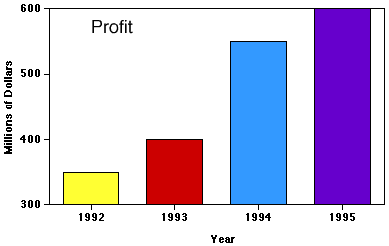
It looks like this company is making mad profit! Why is the graph misleading?
This graph is misleading because __________.
Their profit is actually _____________.
Measures of Center (What is Normal?)
Mean: the average. Add all the numbers then divide by how many there were.
Median: the middle number when the data are in order least to greatest.
Range: the greatest number minus the least number.
Mode: the number that occurs most often.
Show answer
Auto Play
Slide 1 / 34
SLIDE

Similar Resources on Wayground
28 questions
Review Solving Linear Equations
Presentation
•
8th Grade
30 questions
Unit 3 Lesson 1 Pythagorean Theorem
Presentation
•
8th Grade
29 questions
Distance Time Graphs
Presentation
•
8th Grade
27 questions
Factoring Trinomials
Presentation
•
8th Grade
29 questions
Two Way Frequency Tables
Presentation
•
8th Grade
27 questions
Proportional Relationships: Reading Graphs
Presentation
•
8th Grade
25 questions
Dilations
Presentation
•
8th Grade
29 questions
Scatterplot and line of fit review
Presentation
•
8th Grade
Popular Resources on Wayground
10 questions
Safety Day 2026 – Student Review
Quiz
•
9th Grade
21 questions
Continents and Oceans
Quiz
•
6th Grade
20 questions
Parts of Speech
Quiz
•
5th Grade
16 questions
Subject & Predicate
Quiz
•
5th Grade
25 questions
Multiplication Facts
Quiz
•
5th Grade
12 questions
Map Skills
Quiz
•
3rd Grade
22 questions
Continents and Oceans
Quiz
•
5th Grade
15 questions
Rounding Decimals
Quiz
•
5th Grade
Discover more resources for Mathematics
20 questions
Rational and Irrational Numbers
Quiz
•
8th Grade
20 questions
Add and Subtract Integers
Quiz
•
6th - 8th Grade
20 questions
Slope from a Graph
Quiz
•
8th Grade
15 questions
Adding and Subtracting Integers
Quiz
•
6th - 8th Grade
20 questions
Proportional vs. Non-Proportional
Quiz
•
8th Grade
14 questions
finding slope from a graph
Quiz
•
8th Grade
24 questions
Explore Rigid Transformations and Congruence
Quiz
•
8th Grade
13 questions
Finding slope from graph
Quiz
•
8th Grade